
The story of a failed project
This will be something completely different for a change. Let me tell you the story of a project that cost me a ton of time and patience.
The beginning
Many years ago I had the not-so-great idea to make money with my side activities on YouTube. Yes, I was too young and idealistic. Back then I was cutting my videos with Cinelerra – an extremely well performing program with massive functionality that was just perfect for my old hardware. Even all those years back I noticed the website of the project didn’t hold up with current times and it was sad too see well-made software represented this way. The site was not useable on mobile devices and it mainly consisted of endless passages of text on a white background.
As an emergency solution and to not alienate the community with too many changes at once I rebuilt the site and semi-modernized it with Yahoo’s PureCSS. The content and layout of the page was mostly kept in place – with the added benefit, that it was now reachable on mobile devices and thus, ranked much better on Google.
This was always planned to be an emergency solution, though. To this day, the site is missing:
- a clear and precise menu structure
- SEO optimizations
- graphics to make the amount of information easier on the eyes
- modern systems for interacting with the community
- and consistent typography.
Problems – and a new concept
On a project that was as near and dear to my heart as Cinelerra I wanted to do everything perfect from the start. Part of this has been a concept that would make the site stand out much more compared to competitive projects and result in much better search engine visibility.
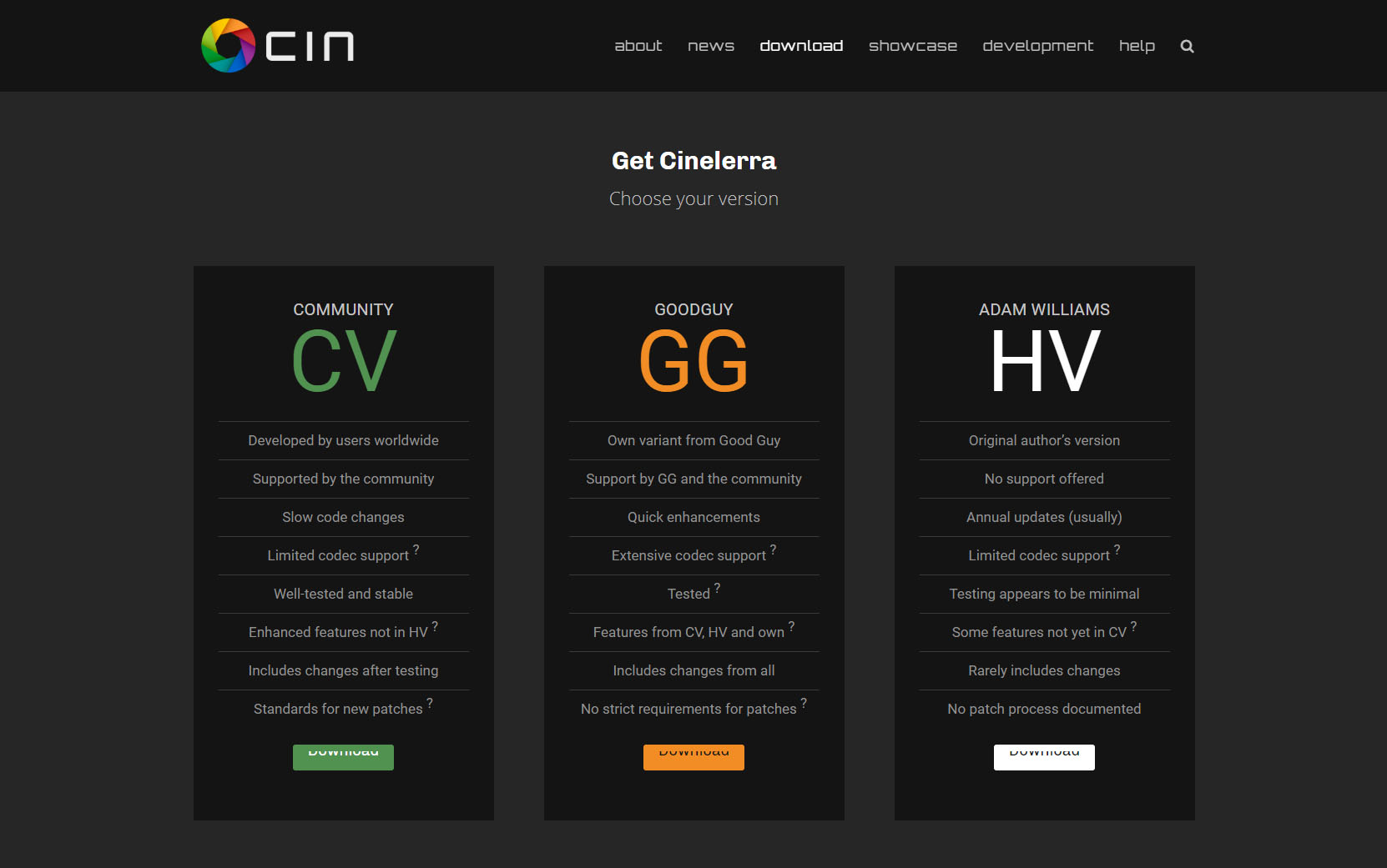
I developed a design that compressed down the 14 current menu options down to six essential points:
- Who are we?
- What are the news?
- Where can I get the software?
- What media has been produced by others?
- I want to help with development!
- I need help with the software!

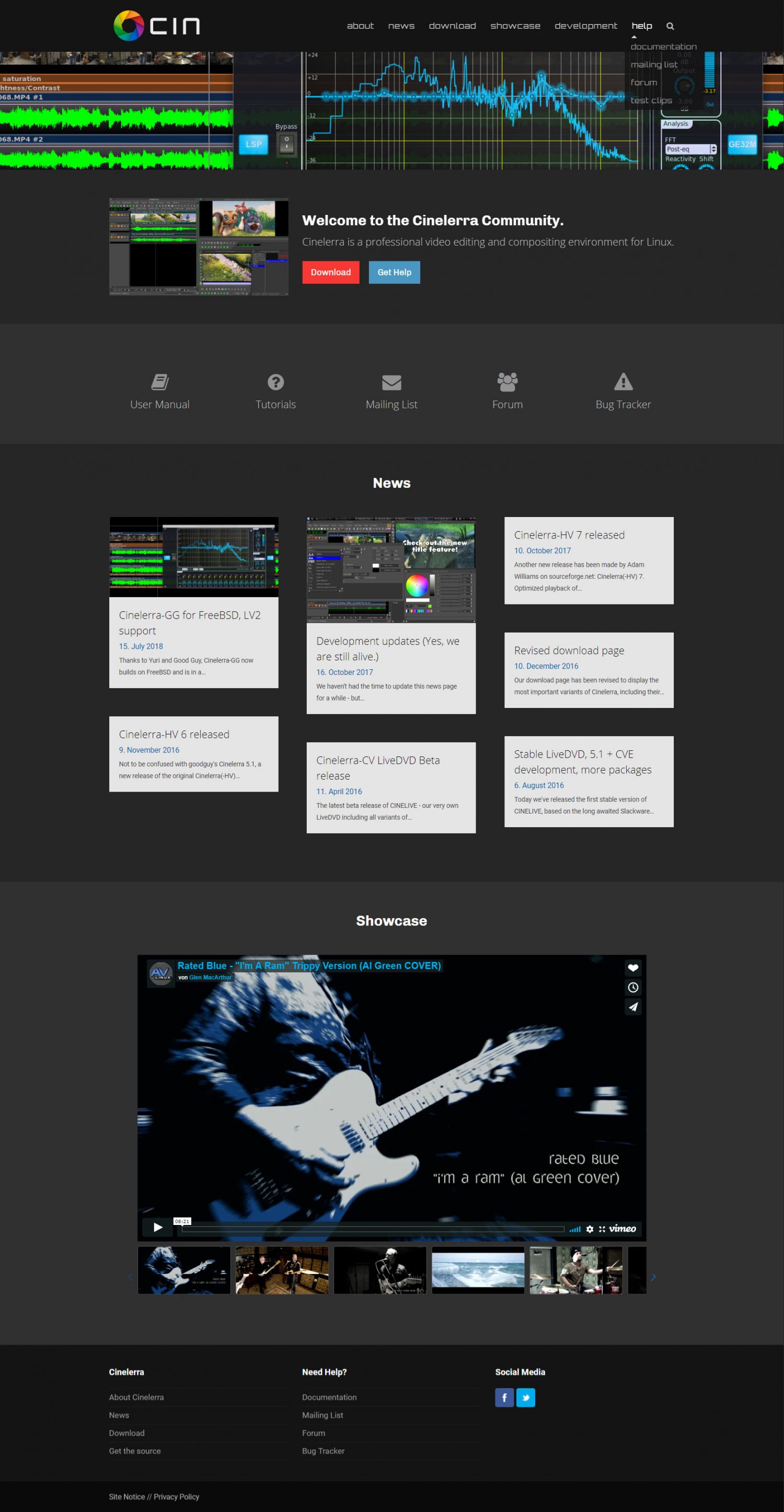

I also planned to extend the current functionality of the website. The project only operates using a mailing list. All developers and users regularly send mails to each other to discuss new features, bugs and everything else that surrounds the project. This mailing list cannot be comfortably searched from outside users and is only useable to those who follow the project for years, have subscribed for a long while and can use their mail client for sifting through the messages.
Thus, my idea has been the integration of forum software to get a younger audience interested in the project. Also, setting up a bug tracker was planned to have an overview of the projects current state of development. As of now, every developer has had his own personal bug list the community doesn’t have any access to.
Additionally, I used the main colors of the program for the design of the website (a few distinctive shades of gray). Another designer (Sam) helped me out with swapping out the extremely aged logo of the project with a modern variant.
The logo had always been one of the biggest points of criticism I had about the project. The “heroine”, a hand-drawn, naked woman had been the mascot of the project for years. From the beginning, the logo didn’t have any reference to a program about nonlinear video editing – apart from a little film strip that isn’t even present everywhere the logo is used.
Originally, it came from a society of women in the field of engineering. Basically, the logo was just grabbed and put into the software a long time ago. It was clear to me that it needed to go away. Sam’s redevelopment of the logo with a shutter as its main visual element finally made a connection to the software itself and would’ve been the ideal solution for the project.
Met with resistance
It quickly turned out be that the community – or better: its most active members – did not have any interest in additional functionality or a visual modernization of their own projects. A few members of the community praised my design, but the criticism was overwhelming.
One developer took the stance that he would never use the bug tracker and the forum. His own to-do list was already big enough.
May be I visit them out of curiousity.
Another member even praised the apocalypse and the total destruction of the project.
Yes, welcome to chaos: duplication of messages, fragmentary messages,
incomplete information in reports, unanswered messages and reports
Sadly, we never talked about the benefits of a forum. Mainly, that it would provide search functionality and a contact opportunity for users of the software.
Although frustrated with the negative basic attitude in this community, I decided to not give up. The project was still able to work without a bugtracker and the forum could be moderated by myself or members of the community, if it had to be this way.
I was surprised, that the modernization of the logo turned out to be an absolutely impossible task, though. I was not willing to devalue all of the work I put into the design by a badly drawn, naked woman.
For others, this seemed to be a requirement:
Where is the woman then naked? What about athletes and dancers, is the sight of them a danger to young people?
In a pretty lengthy mail I explained why this logo was not suitable to me for this project anymore:
Please don't see this as a personal insult, but:
Sorry, that still looks terrible.

It's a typical workaround I come across very often in the design
industry.
A customer doesn't want to spend money for a redesign of the logo (or
they're just stubborn and don't want to change their own ways),
so they come up with:

- fancy images for the background
- dropshadows
- slight tilting

It doesn't change anything for the better.
Let me tell you why this logo is bad:

1. The typography consists of three different fonts.

This is very inconsistent in itself, as if the designer just mashed
together everything he had on hand and it shows.
Doing this results in a logo that is perceived as cheap.

Using one, MAYBE two different typefaces in a logo design is one of the
major rules we must not break.

2. The typography sticks to the logo.

There is no space between the visual image and the text.
This is not a good design. There must be a clear distinction between the
visual element and the typography.

3. The logo does not scale well.

If this logo is going to be displayed as a favicon or an app icon it
will be too small to see what is going on.

4. The star background is unneccessary

The original CV logo consists of a lot of thin lines. Perceiving it in
its original form is already hard enough on the eyes.
With an unsettled background like stars it gets even harder to see.
Also: Designing a logo with an image in the background will always
result in it being a rectangle wherever we put it.

If you put this logo next to logos from other companies (or even the one
from GG we have on the new website right now),
it will instantly look like garbage.

Companies and projects mostly take great care to use transparency and
various geometric shapes on top of that for their own logo designs.
We throw away this opportunity with a design like this.

I propose throwing the green naked hulk where it belongs: In the
trashcan.
The reply to this came back very quickly:
Are you a professional? Then try to redraw it. Only this option is available.
A detour into coding politics
I am not a great coder myself. Apart from basic knowledge of PHP I am not really good. What struck me about this project from the beginning however, was, that new members were only very hesitantly accepted.
Two years ago a new developer (Good Guy) jumped into the project. He became a annoyance in the eyes of the other developers very quickly due to his own way to do work on the software (mainly: working on it for days on end and risk of temporarily breaking something for the sake of a new feature). Good Guy, however, quickly impressed me with his proactive attitude. Whenever someone sent in new designs (themes) for the software, language files or graphics, they were quickly integrated by Good Guy into his own version of the program.
Over the course of the last two years Good Guy therefore created a program, that:
- looks visually pleasing
- works with current audio and video formats
- has the most features out of all Cinelerra variants
- has the occasional bug here and there
During the heated discussion about the logo and redesign some people now started showing their true face and the aversion for the better coder. The one, that just didn’t want to stick to the good, old rules:
William Morrow aka GoodGuy came to this community in Jan. 2016. This
community already had established rules, style and traditions.
[...]
These are good rules. These rules provide a future for Cinelerra (for any
branch).
[...]
Does anyone from the developers  like GG's coding workflow ?
I guess (these are only my assumptions and guesses) no one.
Another developer made this even more clear when I talked about my wish to continue the project on another domain by myself instead of arguing all the time:
This is the best solution.
[So] he does not break working solutions just for fun.
At this point in time it started to become clear to me that there would never be a consensus between me, the developers and various members of the community. Everyone already had their own standpoint about the project and the developers were working for years on it using their own personal way. Added to this, there was jealousy about a new person who was advancing the project in record time without sticking to the existing ruleset.
Due to this ruleset, the main project has had only eight measly little code changes during this year. In my eyes, it is dead. Making it revelant again and bringing it back on a new track cannot succeed without changing some old ways of work and having a fresh and open mind for new things.
The moral of this story
I have never worked on a web project that has been as frustrating as the community of Cinelerra-CV. This toxic attitude towards anything new doesn’t even exist in commercial projects I do for my employer. While I was taking part in this discussion, there were some inevitable emotions. During this phase, I had the thought of never working on a project out of idealism without getting paid ever again.
Now that I can think much clearer again, I have to say, that this is bullshit.
Cinelerra-CV is only one very bad and negative example of a project. I will continue to work on emotionally rewarding projects like the community of hirnschwund.net or the fan website for the Independence War series.
My back is now turned to the Cinelerra-CV project, though. I wish them all the best for future endeavors – there is no pleasure in working for this project anymore. At least the design I had planned to work into the new website has now come alive on this blog. ❤
Thank you for summing up the story in a factual manner. Now let’s have some Fun !! and make more changes to move forward. There are a lot of interesting things that can be done and I am looking forward to see what your expertise brings to this website. Go for it !!
I am pretty much burnt out now.
It’s way too stressful to keep working on the project, so I’ve decided to quit.
The community isn’t really appreciative of what I do, so I will spend my spare time with more enjoyable things. I’m sorry.
It’s really unfortunate.
However, you did announce that you now wanted to focus all your efforts solely on the development of Cinelerra-GG, whose developers and supporters had nevertheless shown great enthusiasm in general for your approach and your contribution. Your proposed site also offered great opportunities for progress.
I don’t understand what made you change your mind, there was a community around GG that welcomed you positively and with which you seemed to have a lot in common. But well, obviously the development of Cinelerra-GG will continue and you can always come back if you change your mind.
Pierre
Yes, I did announce that I wanted to move away from CV and make a website solely for GG. When I wrote about these plans, I was still very emotional and angry about the stubborness of the CV community and it was more of an act of defiance.
I obviously had more time to think now and the truth is: This project has made me feel absolutely horrible for one week. I put a whole weekend into the design. A weekend were I wasn’t able to rest and get my strength back for projects at work. The negative responses of the community resulted in me underperforming in the real job I do. The one that brings me money.
So I have finally decided to let someone else do the work. I don’t want to contribute to a split of the community and I want to keep my mental strength for things that matter more in my life.
Danny thank you very much for all your efforts in trying to make this project more beautiful and efficient.
I regret your decision because you really brought a modern look and a better communication to cinelerra.
I wish my best for you in your projects.
Of course hope you will be back someday.
Thank you for your kind words, Haldun.
I also hope I will be able to get back to the community one day.
But for the forseeable future I need to focus on projects that bring me joy instead of misery.
I’m not the only web developer in the world. Surely someone else can take over. 🙂
-Danny
This is NickFe, a very inconsistent contributor to CinCV and to some extent maintainer of the Ubuntu launchpad binaries. First, thanks for your hard work, despite the frustrations. I actually gave up long before, as my very basic, yet willingness was poorly considered and often insulted. I hoped to see a platform modernization in CV that never came to be, so I just left. I am not ideological about these things, it’s either my contribution matter or at least the effort is appreciated or there is plenty of other stuff out there worth wasting time on. Regarding CinGG, while I like the spirit and proactiveness, I find it difficult to maintain. There has to be structure in the releases, which appear to be random. I prefer different development branches, (think Google Chrome), which works extremely well and allow people to have a consistently reliable product. But that is just me. Good luck with your future endeavors!